Distribution Company Research
A Distribution Company is responsible for promoting and releasing a film to the general public.
In a similar way to a production company, distribution companies want to create a tone at the start of the film. However their role is to show a professional ability to provide the public with a film. Therefore, common themes are movement around the world and vast free spaces such as the sky or space. They also aim to be clear and memorable, often achieved through bold wording in their logos, coupled with dramatic and/or ambient sound. Below are some examples of major distribution company intros.
20th Century Fox
|
20th Century Fox's approach is to present themselves as powerful and valuable as a brand. To do this their logo uses gold colours and dramatic music, giving them a sense of credibility. The use of spotlights could allude to their classic Hollywood film ties, as if on a old film lot. 20th Century Fox have been responsible for the distribution of horror films such as Alien, 28 Days Later and The Omen.
|
|
Universal
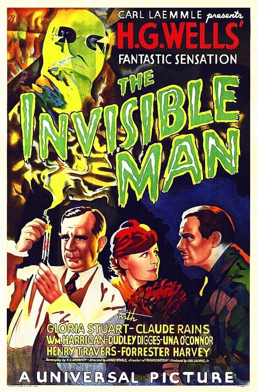
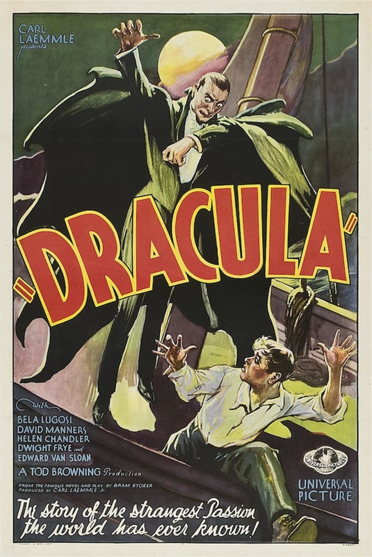
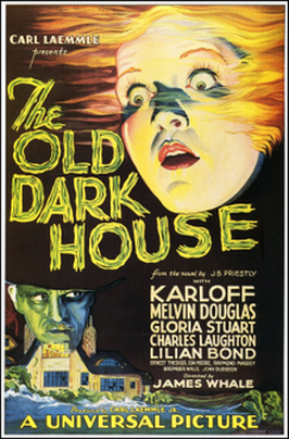
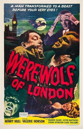
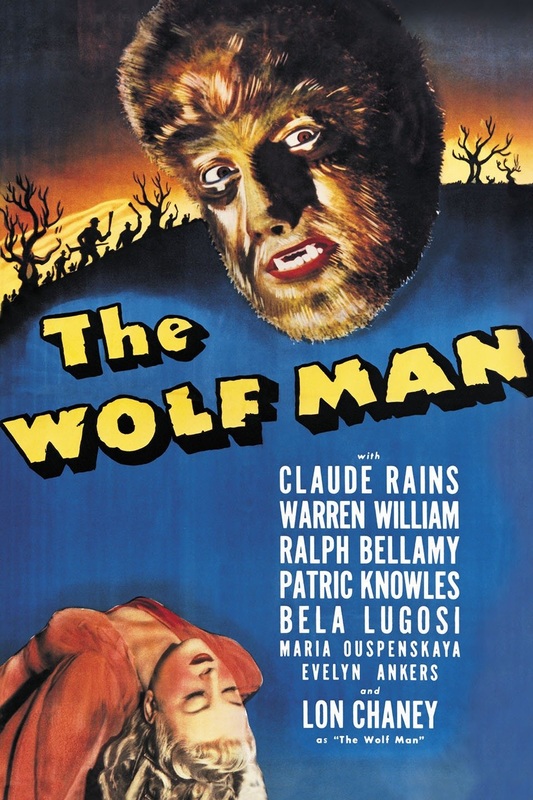
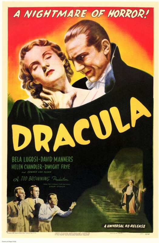
Universal present themselves as a worldwide brand, through using the planet as their logo. This shows they are both international, and large as a company. It also shows they are able to distribute products on a vast scale. Dramatic music again gives them a professional power, but a simple short track means it is memorable. Universal distributed a huge amount of classic horror and monster films in the 1930's and 1940's
|
|
|
Warner Bros.
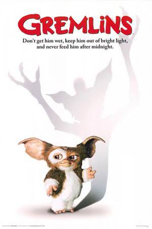
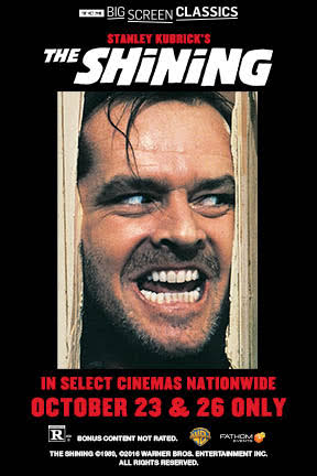
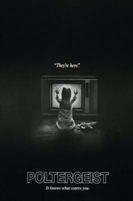
Similar to 20th Century Fox, Warner Bros. want to show their roots in classic Hollywood by using images of their film lots. Gold again shows value, whereas the cloud background gives the sense of being natural and the idea that their reach is vast. Warner Bros. have distributed horror films such as The Exorcist, Poltergeist, Gremlins and The Shining.
|
|

|
|
Our Distribution Company, Infinity Pictures
For our Distribution company we went for a name for the reason Universal has their name, a word that is vast and implies a ideology of a want for worldwide release. We used the theme of movement, which we conveyed by using a wide shot of a starry sky. We used calm music rather than dramatic, however with tried to have a simple sound that is memorable and instant to recognise. The green and blue colours are to convey renewability, as if the company is there to restore classic film initiatives or ideology, and to represent the earth and its natural colours.
