Font Choices And Justifications
Film Opening Title
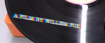
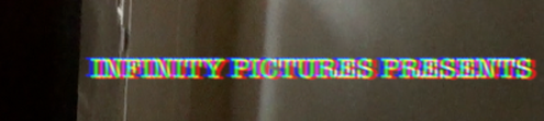
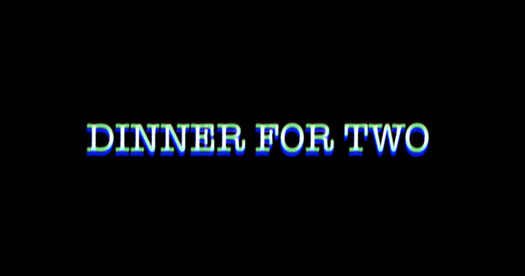
Example Of Titles
We decided to use this font style because it suggested the feeling of disorientation that we wanted to convey throughout the OTS. The washed out colours of the words also added to this as they felt as cold and broken. We used a prism video effect on the titles to achieve this look.
Fonts used in other OTS
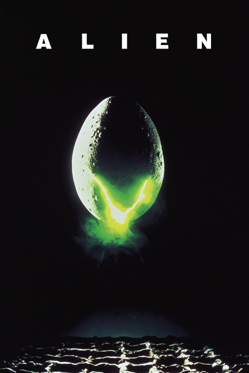
Alien
The font used in Alien is very simple, which adds to the films aesthetic of having a hidden villain until near the end, and the very flat unexpected tension.
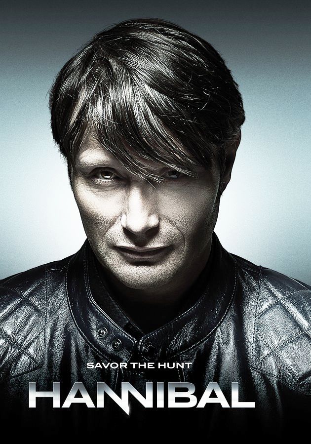
The title used in Hannibal has been deliberately designed to look like knives, adding to the imagery of cooking and murder.
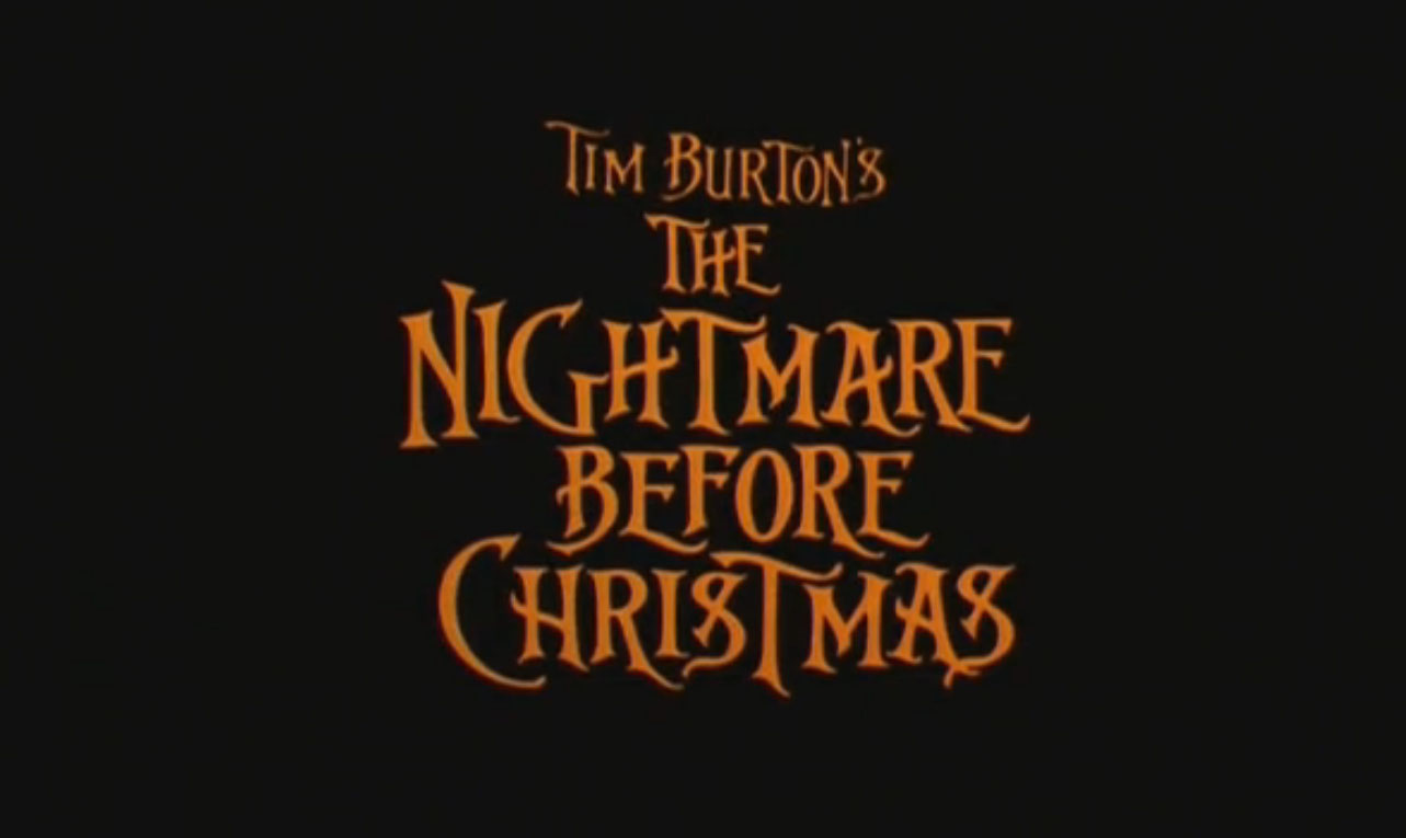
The orange/black colour scheme and font reflects the halloween themes of the film, and the "pumpkin king" protagonist.
